
ASSIGNMENT 8(b)
STILL LIFE
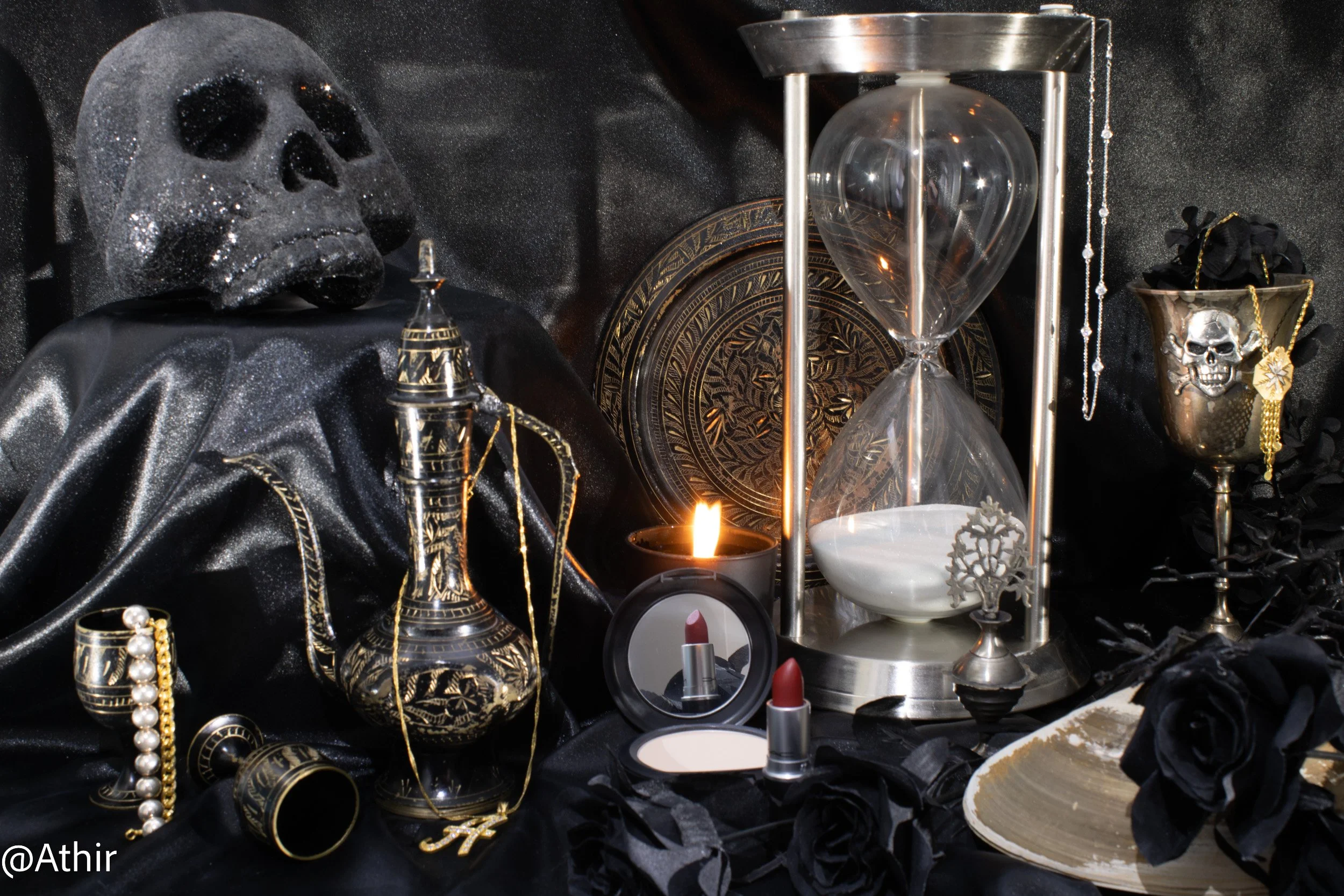
Still Life in the Dutch Style of Vanitas
Still Life: Red Lips
November 14, 2022. Chicago, IL USA. Photo by Athir.
4.0 sec (f/11 ISO 100, 28 mm)
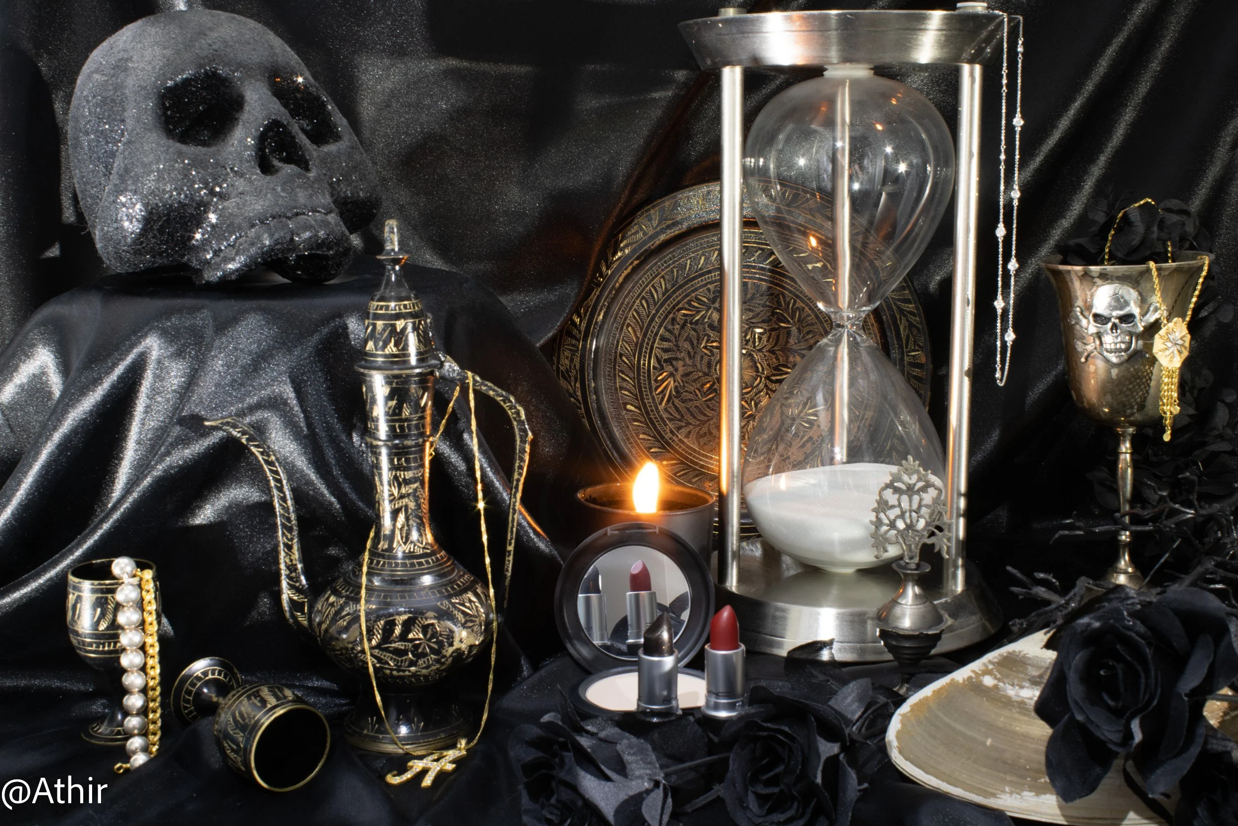
Still Life: Dark Night
November 14, 2022. Chicago, IL USA. Photo by Athir.
4.0 sec (f/16 ISO 200, 28 mm)
REFLECTION
Once I learned that the the Vanitas style was an option for this project, I threw myself into working on it. I have long been both consciously and unconsciously obsessed with the style, beginning with my days as a painting/drawing/etching student. Like the Dutch style painters, I was attracted to the style because it demonstrated skill in painting metal, glass, cloth, and light. I begged my college art instructors to show me how to achieve this skill, so they placed me before still life, beginning with many paintings of still life, and evolving to a more surreal approach, to sharpen my own skills. Because I already collect many of these symbolic objects during my own travels, gifts, or due to my own vanity (or my early realization of everyone’s rapid descent toward the inevitable) I decided to take a gothic, punk rock approach, to stay true to both my lowbrow and highbrow self. Since I only wear black (which is all the colors combined, contrary to what so many people believe), I also decided to use all or mostly black objects for a gothic, (mostly) monochromatic - inspired Vanitas still life.
Here are the items, most from my own personal collection with a few that are borrowed, that are included in my gothic-inspired Vanitas still life:
Black satin backdrop
Hourglass
Black candle
Black compact with mirror
Red lipstick
Black lipstick
Diamond necklace
Silver bracelet
2 Gold necklaces
Gold bracelet
Silver goblet w/skull emblem
Large ocean shell
Black roses, black flowers, black branches (all artificial)
Bottle of authentic kohl (Mom’s, given to her by my grandmother)
Black coffee pot w/ matching coffee cups/goblets and tray (Mom’s, given to her by a relative)
Black glittery skull (friend’s, punk-rock salon-owner)
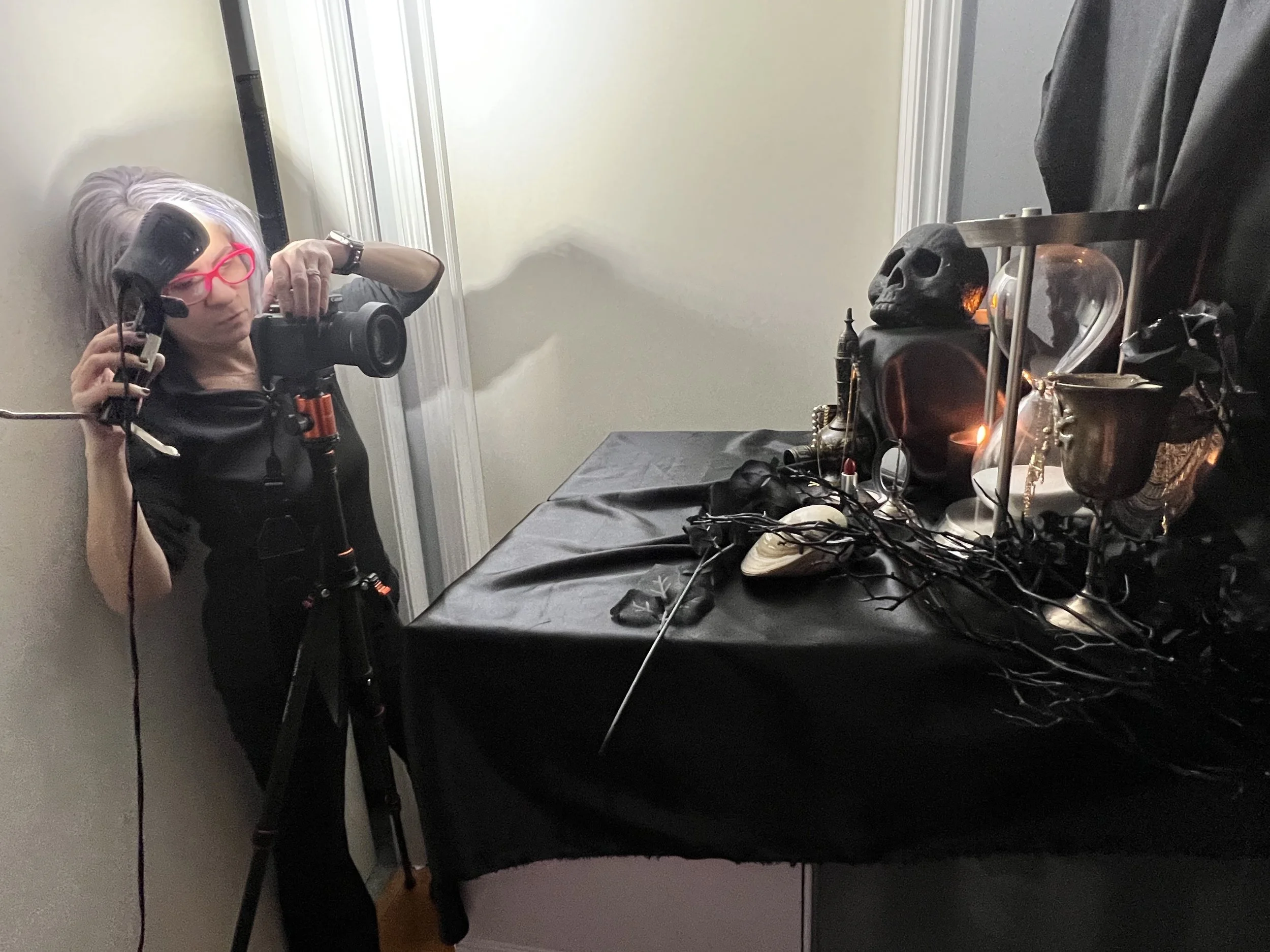
From a technical perspective, I was surprised to find that my setup required as little lighting as possible and I found myself experimenting with different angles and sources. I took shots with light coming from top, front, below, and multiple locations. I found that in the end, the best shots had the least light as possible, if I adjusted my camera settings appropriately. I kept my ISO as low as possible, although my camera does not permit me to drop it below 100, but 100-200 seemed to work best to avoid grain.. The aperture needed to be narrow enough to increase the depth of field and keep the various objects in focus. This took a look of trial and error, while I worked with really slowing down the shutter speed at times. This had to do with the super dark corner I work in for my still lifes (see photo above), as well as the extra, extra dark subject matter I was working with. Also, it seems to be dark all the time now, at least once I figure out what I am doing. But I held onto light sources for what felt like an eternity dozens of times, when it was really only 4.0 seconds. White balance was adjusted for all images prior to export.
This project proved to be more difficult than I initially thought, but not for the reasons I had anticipated. I already owned many of the items needed to assemble the still life, because I really, really love the symbolic subject matter inherent to this style. Life, death, opulence, light, darkness, the fleeting of it all. I also once used to write associated poetry with it, but that is a completely different story no one needs to know about right now, even though I crank one out every now and then.
However, for some reason, I still spent hours getting everything together. I had to purchase a satin sheet (2 types, actually; one heavy, one lighter in weight) from a fabric store, and I am not sure I have ever purchased anything from a fabric store. Once I finally assembled everything, I realized there were visible creases in the satin sheet, requiring that I disassemble everything in order to iron it. Only, I had no idea where my iron was because neither my husband or I has a dress code and we never iron anything. I have not seen my iron since moving into my current residence for the past 6 years and likely have not ironed anything in at least 15 years. It took me about 2 hours to find the iron and smooth out the sheet. Despite this, I loved setting up the scene while hating every moment. It suited the dichotomies found within the style.
My desire to work in a fully black, nearly monochromatic scheme also proved to be more challenging than I thought, with lighting and visibility of the objects. Black on black is not always easy to work with. Some objects were either getting underexposed or overexposed, when this may not have occurred had there been an array of color, so playing with light and settings was much more nuanced than I initially thought. Finally, physical space continues to be a problem. While I absolutely love photographing this type of still life, I mean LOVE doing this — and I love assembling the sets required to shoot these — it will likely be my last, until we move into a larger unit or I get the multi/mixed media studio I have long dreamed about.
LIGHT PAINTING
Why did I create a light painting? At 30 seconds, it was no easy task. I repeated it multiple times because I had no idea what I was doing in the dark, and there were so many objects I had to memorize their placement! I also kept getting multiple flames and while this one is not entirely perfect by any means, I am not entirely hating it either. I usually dislike warm colors and warm light, but I was able to get a decent golden glow, as opposed to an overexposed reflection off the back platter. That felt like a win. Many of the other light paintings I came up with for this were not even remotely presentable, so I was glad that this was completely lit up and in focus.
Light Painting
November 14, 2022. Chicago, IL USA. Photo by Athir.
30.0 sec (f/25 ISO 200, 28 mm)